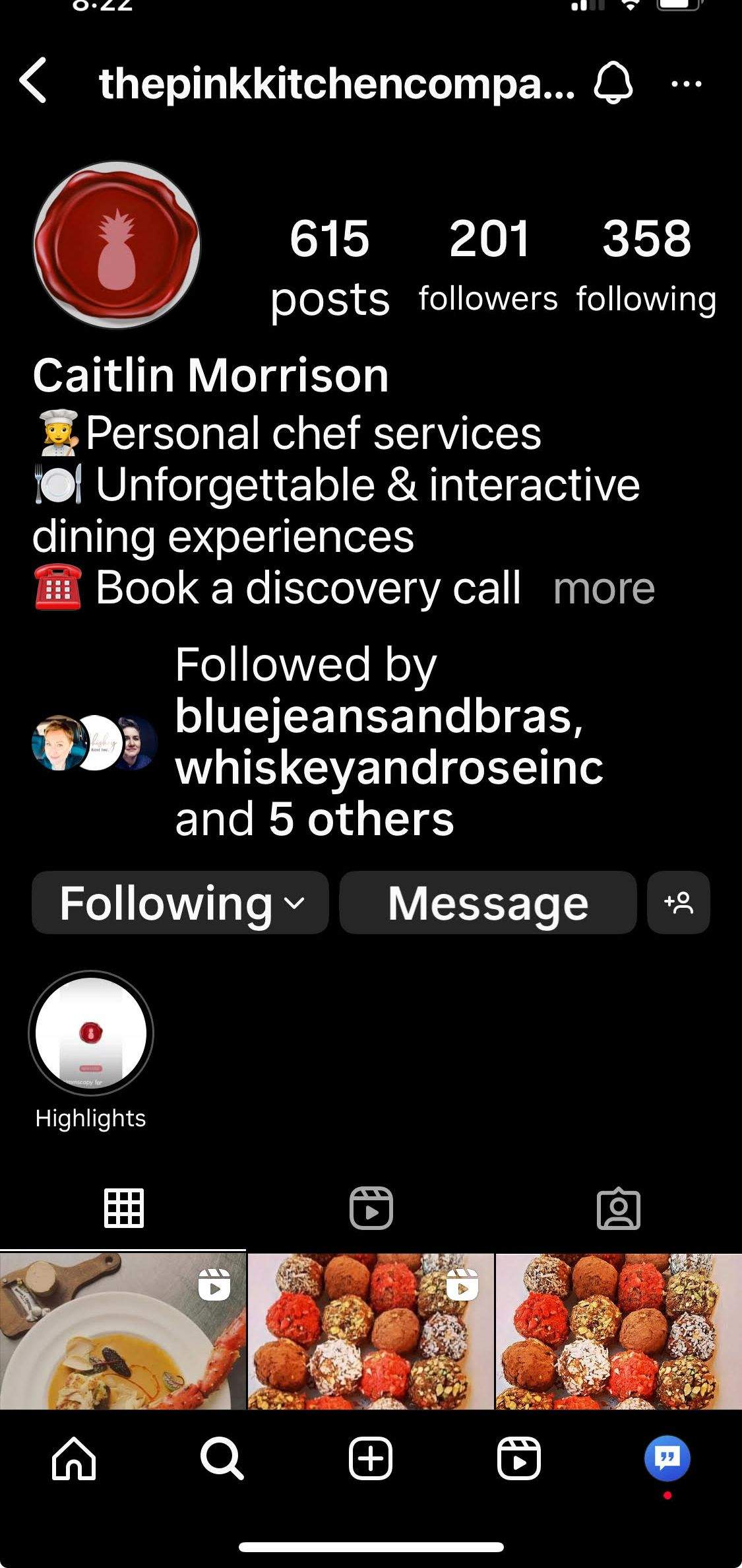
The Pink Kitchen Co.
Logo & Tagline Rebrand
Project background
The aim was to create an overall new look and feel for the company brand while holding onto the same brand voice.
GOALS
new logo
new tagline
new business cards with design
Audience & Tone
Customers are aged 28-60 with a $50-120 000/yr income. They are educated 9-5’ers, with some retirees in the mix. These dog owners, cottage dwellers, and caretakers desire more social activity. This group appreciates exciting and nourishing food that gives them time to become better versions of themselves.
The tone will include the usual bright, fresh, friendly, and fun "pink attitude" with additional modern, feminine, and opulent elements. Prominent pink backgrounds will be switched out for white.
Creative Process - Logo
I was provided inspirational pictures for colour themes and moods, allowing for a more precise creative start-off point.
Round 2 offered the finished product after some minimizing.
Pink meaning - love, nurture, compassion, charm, femininity;
"in the pink" is a sign of good health;
"tickled pink" evokes the emotions of happiness
A pineapple is a lasting symbol from centuries past of hospitality, welcome and friendship; sometimes used as the "crowning" piece in large displays of food or a simple reminder to wear your own crown
Red seal - signifies a high standard of culinary skills and knowledge.
Creative Process - Tagline
After delving deeper into The Pink Kitchen Company's tone and persona, I developed a working mission statement:
"To provide delectable and nourishing meals made with love that offer time to experience a life well-lived"
I worked through new benefits and value proposition templates as Chef Caity's service changed to private chef services. Also, after listing the what, who, and whys, as well as differentiators, I was able to streamline a direction:
Confidence in health, energy and ability to live a life of abundance, fun and freedom
We give you nourishment
We give you time
We give you freedom
We offer joy
Joyful Cooking Inspired by Freedom
Freedom Inspired Cooking
Joy Inspired Catering
Freedom Inspired Catering
